
Walk into two identical rooms one painted a soft sage green, the other a stark white and you’ll feel two completely different things before you even notice the furniture. That’s not coincidence. It’s color psychology, and it’s one of the most underrated tools in interior design. The right paint color can calm a racing mind, sharpen focus, or spark a burst of creative energy. The wrong one can quietly work against you for years without you ever knowing why a room “just feels off.”
If you’re planning a repaint and want more than a Pinterest-pretty palette, this guide breaks down how color psychology actually works, room by room. For homeowners in the Gulf region looking for premium, low-VOC paint options to bring these ideas to life, PrimeEdge FZE offers a range of interior and exterior paints formulated for both durability and finish quality worth a look once you’ve settled on your palette.
Why Color Psychology Isn’t Just a Design Trend
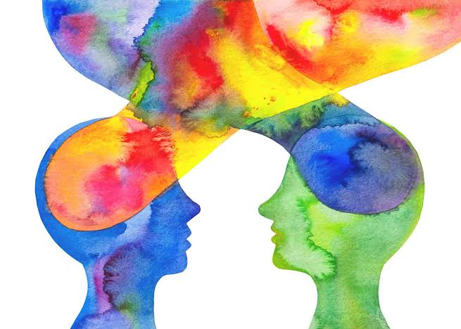
Color psychology is the study of how hues influence human emotion, cognition, and behavior. It’s grounded in decades of environmental psychology research showing that the visual input our brain receives from a space directly affects hormone levels, heart rate, and even decision-making speed. Warm colors like red and orange tend to raise arousal and energy. Cool colors like blue and green tend to lower it, promoting calm and focus.
This isn’t about superstition it’s measurable. Studies on classroom and office environments have repeatedly shown shifts in concentration, stress, and even short-term memory recall based on wall color alone. So when you’re choosing an interior paint color, you’re not just picking an aesthetic. You’re setting the emotional tone of everything that happens in that room.
Bedroom: Designing for Rest, Not Stimulation
The bedroom is the one room where the goal is almost always the opposite of “energizing.” You want colors that lower cortisol and ease the transition into sleep.
- Best choices: Muted blues, soft greens, warm neutrals, and dusty lavender
- Avoid: Bright reds, oranges, or high-saturation yellows they’re proven to increase alertness, which is the last thing you want at 11 p.m.
A soft, matte blue-gray has become a favorite among sleep-focused interior designers for a reason: it mimics the visual cues of dusk, which subtly signals the brain to wind down.
Kitchen: Encouraging Energy Without Over–stimulation
Kitchens benefit from warmth, but there’s a fine line between “inviting” and “overwhelming.” This is where a lot of homeowners get it wrong going too bold and ending up with a space that feels chaotic during busy mornings.
- Best choices: Warm yellows, soft terracotta, sage green, or creamy whites
- Avoid: Overly saturated reds in small kitchens, which can feel aggressive rather than appetizing
Yellow in particular has a strong association with optimism and sociability, which is likely why it remains one of the most consistently popular kitchen colors across cultures and decades.
Home Office: Optimizing for Focus and Productivity
With remote and hybrid work now permanent fixtures for millions of people, the home office has become one of the most researched rooms in modern interior design. The wrong color here doesn’t just look bad it can measurably reduce output.
- Best choices: Blue (associated with trust and mental clarity), green (linked to reduced eye strain and sustained focus), or a soft gray for a neutral, distraction-free backdrop
- Avoid: Bright orange or red both raise physiological arousal, which is useful for a gym, not for deep work
If your work involves long stretches of screen time, many designers now recommend pairing a muted blue or green base coat with one accent wall in a slightly deeper shade, giving the eye a resting point without introducing visual clutter.
Living Room: Balancing Comfort and Conversation
The living room has to do double duty it needs to feel relaxing for quiet nights in, but also energetic enough to host guests. This is where earth tones shine.
- Best choices: Warm taupe, olive green, soft clay, or muted gold
- Avoid: Cold, sterile whites in large open-plan spaces they can make a room feel clinical rather than welcoming
Earth tones work because they’re psychologically associated with stability and groundless, without the stimulation overload of primary colors.
Bathroom: Clean, Calm, and Spa-Like
Bathrooms are small, often windowless spaces, which makes color choice even more impactful because there’s less room for the eye to escape a bad decision.
- Best choices: Soft aqua, pale gray, sea-foam green, or crisp white
- Avoid: Dark, saturated colors in small bathrooms without strong ventilation they can make the space feel damp and cramped
Spa-inspired blues and greens consistently test well because they echo natural elements water and plant life that the brain associates with cleanliness and calm.
A Practical Framework for Choosing Your Palette
Rather than picking colors room by room in isolation, try this three-step approach:
- Define the room’s primary function. Is it for rest, focus, socializing, or a mix?
- Match the color temperature to that function. Cool tones for calm and focus, warm tones for energy and connection.
- Test before committing. Paint large swatches (at least 2×2 feet) on each wall and observe them at different times of day natural light dramatically changes how a color reads.
The Undervalued Role of Paint Quality
Color psychology only works if the paint itself holds up. A beautiful sage green loses its calming effect fast if it’s peeling, yellowing, or showing brush marks within a year. This is where paint quality pigment stability, VOC levels, and finish durability becomes just as important as the shade you choose. Companies offering professional-grade interior paint solutions can make the difference between a color that ages gracefully and one that needs a redo in 18 months.
Final Thoughts
Paint color is one of the cheapest, fastest ways to change how a space makes you feel but only if you approach it with intention rather than trend-chasing. Before your next repaint, ask what each room is actually for, then let color psychology guide the palette from there. Your walls should be working for your mood, not against it.
Leave a Reply